Check The Space is a premium vintage fashion brand built around the idea that secondhand clothing can carry the same weight as luxury. The identity needed to reflect that — sharp enough for a fashion-forward audience, confident enough to compete with new.
Challenge
Vintage fashion in Romania sits in one of two places: thrift-store casualness or overpriced hype. Check The Space occupies neither. The challenge was building a brand identity that signals premium without losing the raw, editorial edge that vintage culture demands.
Goal
Design a logo system and visual identity that positions Check The Space as a mature, fashion-literate brand. One that feels at home next to international references — not like a local store trying to look the part.
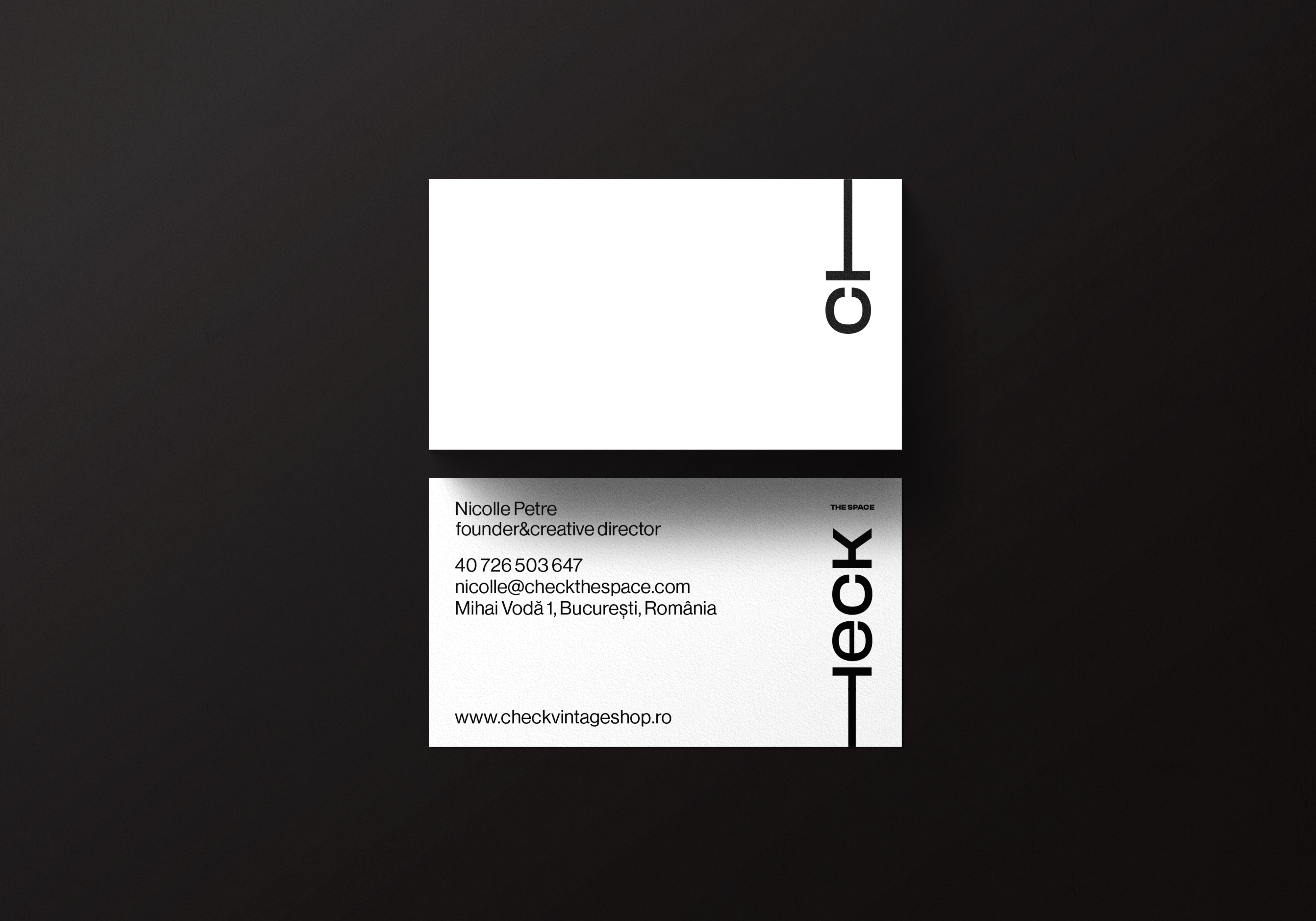
Result
The wordmark uses a bold display typeface where uppercase and lowercase coexist in the same mark — creating visual tension that feels deliberate, not accidental. The logo extends into a modular system across sub-brands: The Space, The Garden, The Shop, The Bar. Each variant carries the same mark with a typographic device replacing the "H" in "THE" — a horizontal line that acts as both a design element and a spatial reference. One brand. Multiple rooms. The identity holds across all of them.