Strong directions that remained unreleased.
Sprizzetti
Sprizzetti sips meet mythical mischief! This label concept takes Bacchus & Dionysus on a modern taste adventure, sparking a playful twist on tradition. #TimeTravelersOfTaste #Sprizzetti

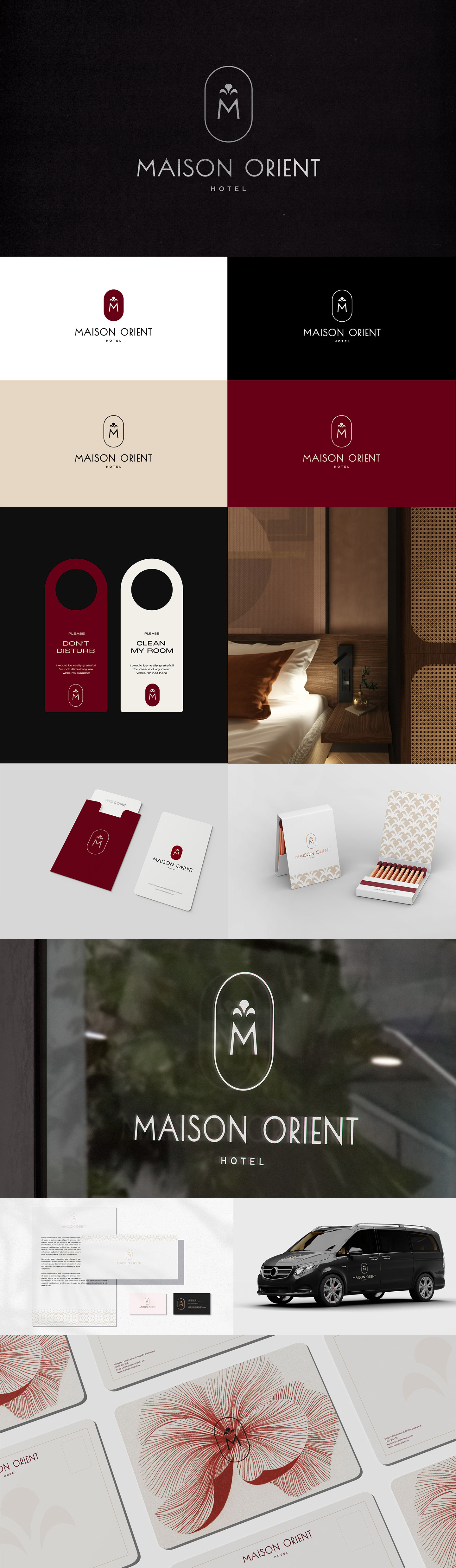
Maison Orient
Maison Orient brings together Parisian elegance and Asian artistry in a refined hotel identity. The concept centers on the letter “M,” standing tall and balanced. Above it, the Huadian symbol adds cultural depth and references traditional Chinese beauty and refinement. The negative space between the two elements forms a subtle heart, expressing warmth, connection, and hospitality. The identity reflects harmony and cultural fusion. It positions Maison Orient as a place where elegance meets emotion, and where guests feel both inspired and welcomed. #TheHeartofHarmony
Antik
Since 1998, Antik brings Alba Iulia's heritage to life. This shield logo reflects both tradition & quality, while the menu offers a symphony of flavors from Antik Pizza, Food & Gelato. #AntikAlbaIulia

Modumental
Built to Last, Designed to Adapt. Modumental furniture blends industrial strength with modern modularity. The logo, inspired by industrial table legs, transforms into letters, showcasing strength, style, power and flexibility. Mix & match for a look that's uniquely yours. #ModumentalFurniture

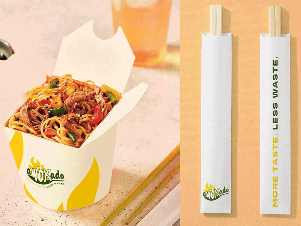
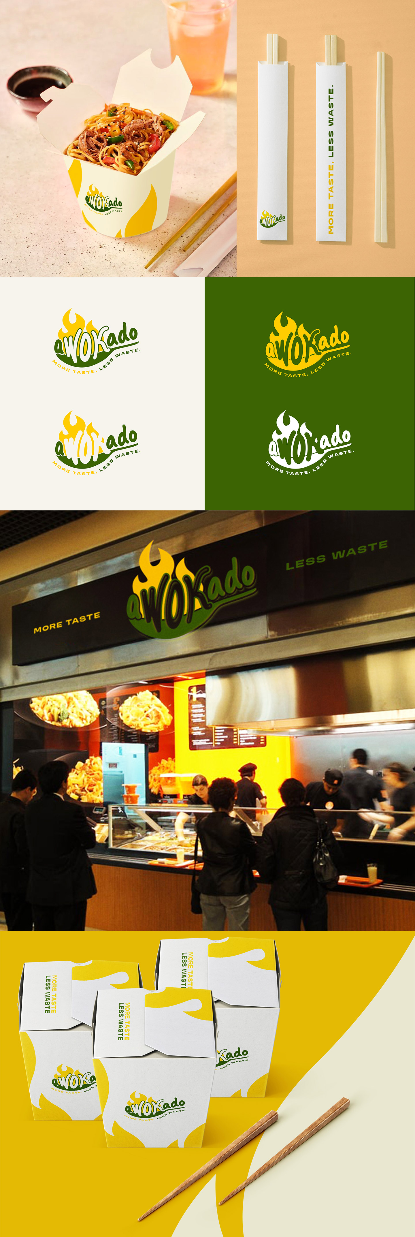
Awokado
aWOKado focuses on generous portions while reducing food waste. The identity places the wok at the center, shaping the logo and highlighting the cooking process. The avocado green tone references avocado oil, while the flames express heat and energy. The result is a clear and flexible identity designed for packaging, labels, and everyday brand communication. #MoreTasteLessWaste
Answear Graphic Design Contest
International contest for digital artists.
